The Outcome
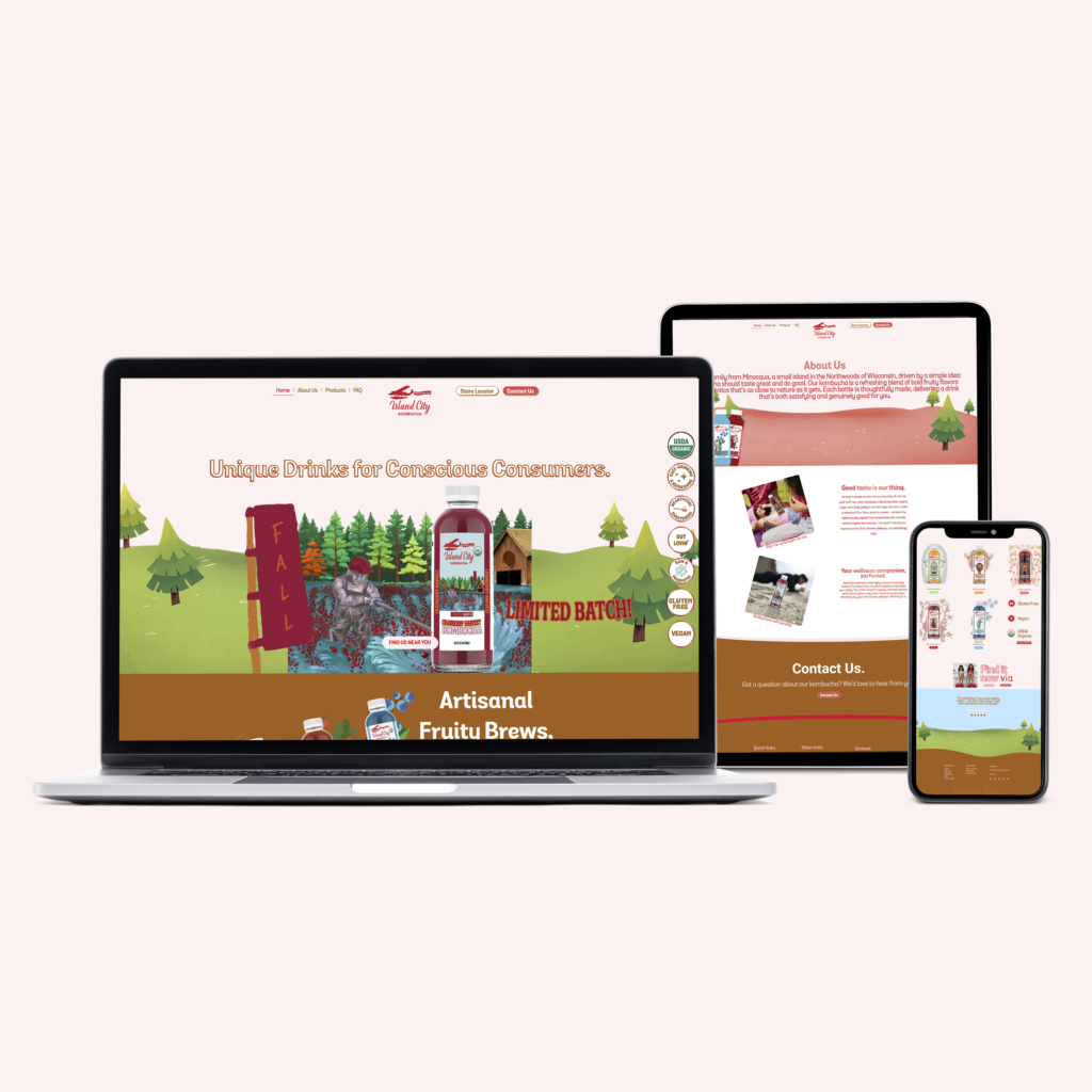
The rebrand has positioned Island City Kombucha as a standout in the Midwest kombucha market, ready to expand its presence and deepen its connection with consumers:
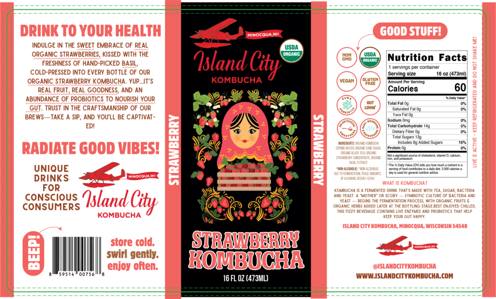
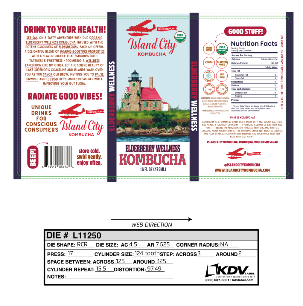
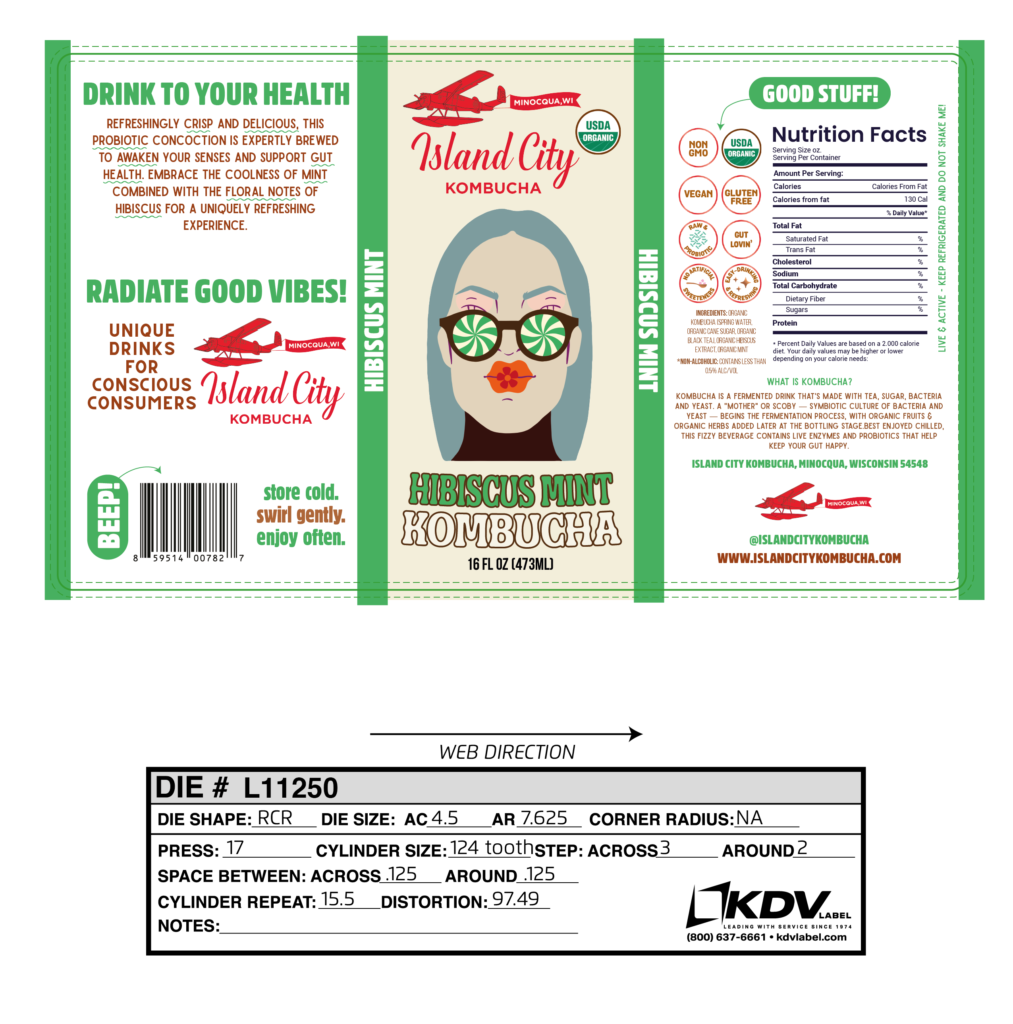
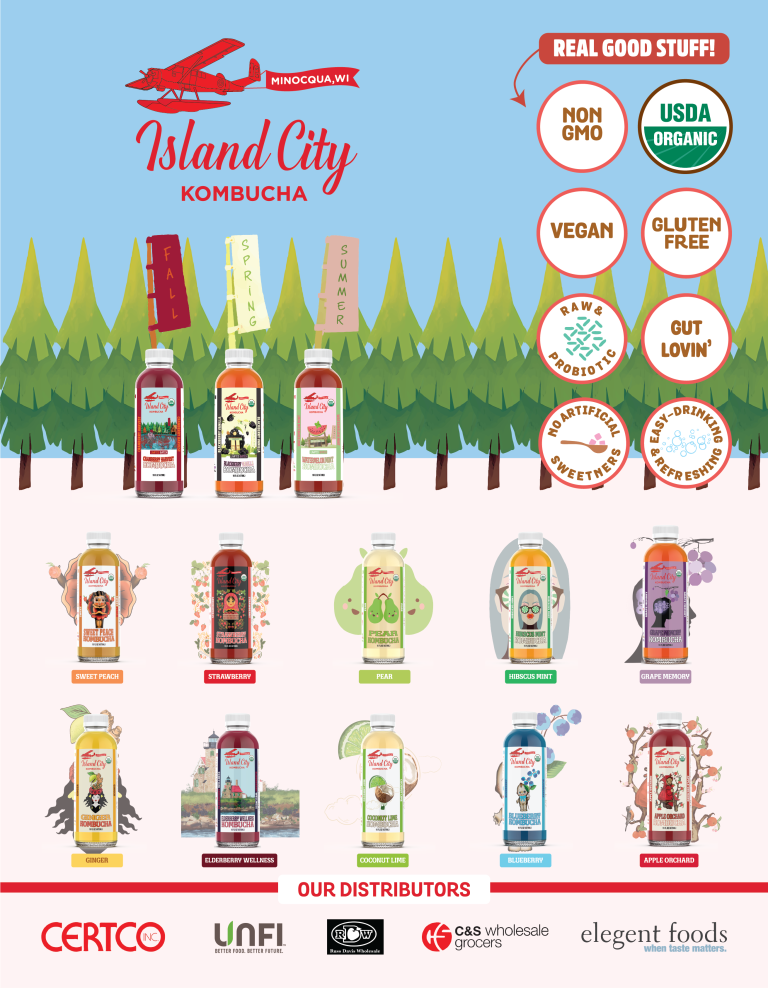
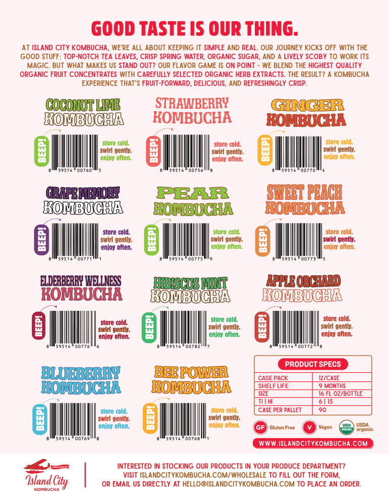
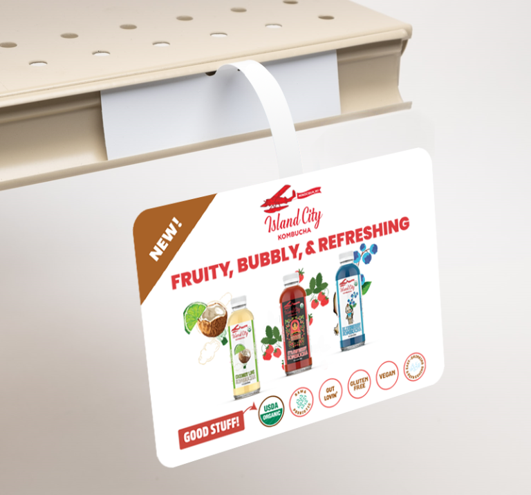
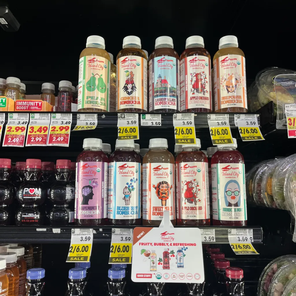
- Enhanced shelf appeal with vibrant, eye-catching packaging that tells a story.
- Stronger customer loyalty by highlighting the family’s origins and commitment to quality.
- Clearer messaging, making the brand’s mission and benefits accessible at a glance.
- Growth-ready positioning, setting the stage for success in new markets.
Island City Kombucha is more than a beverage—it’s a reflection of a family’s passion for craft, connection to nature, and dedication to delivering kombucha that’s genuinely good for you. This rebrand celebrates its roots while embracing an exciting future, one refreshing bottle at a time.