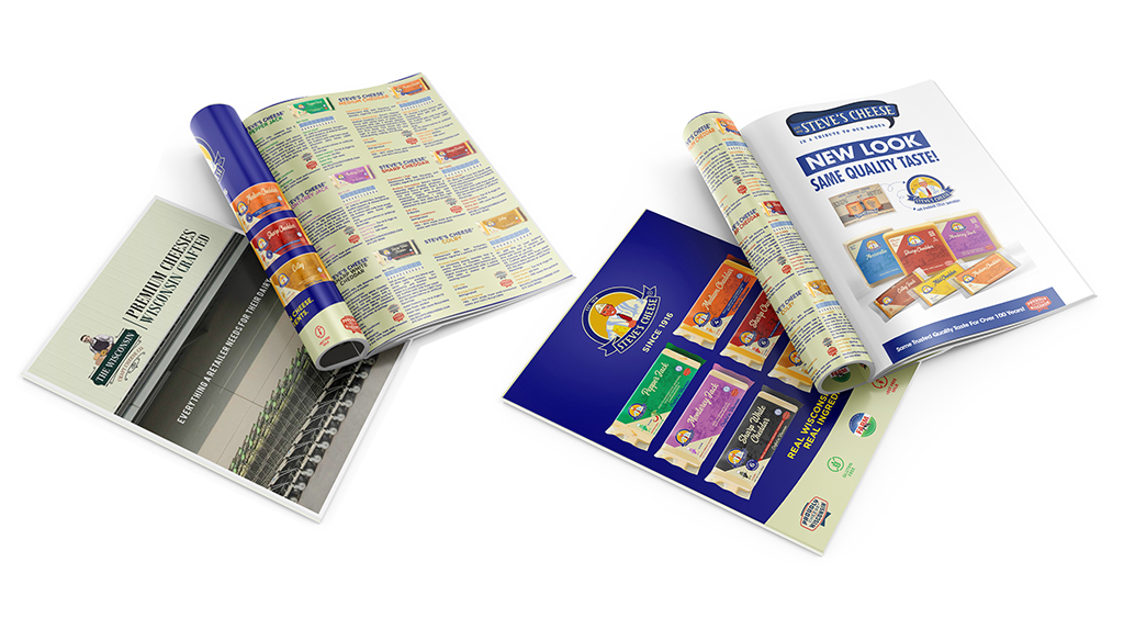
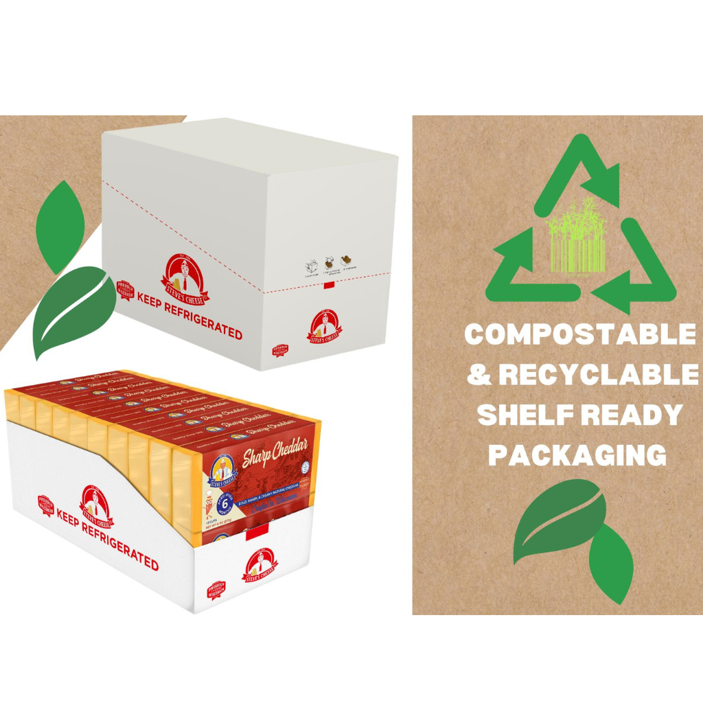
For the Brand collaborated closely with Steve's Cheese to establish a distinctive positioning and visual identity. Together, we revolutionized Steve's Cheese brand packaging, capturing their premium quality and rich heritage story. The aim was to embody the crafted premium product and evoke the nostalgia of its dairy roots in an engaging and unique manner while differentiating themselves on retail shelves against competition.
Outcome
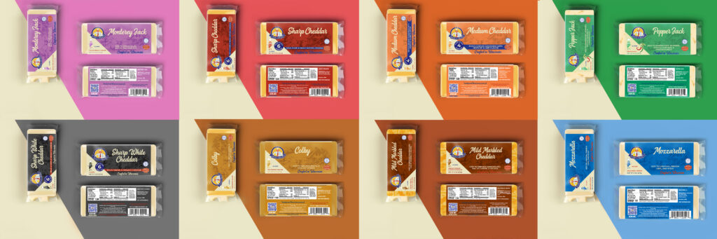
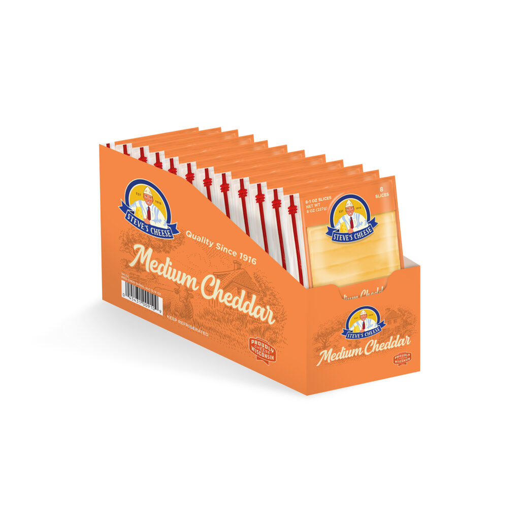
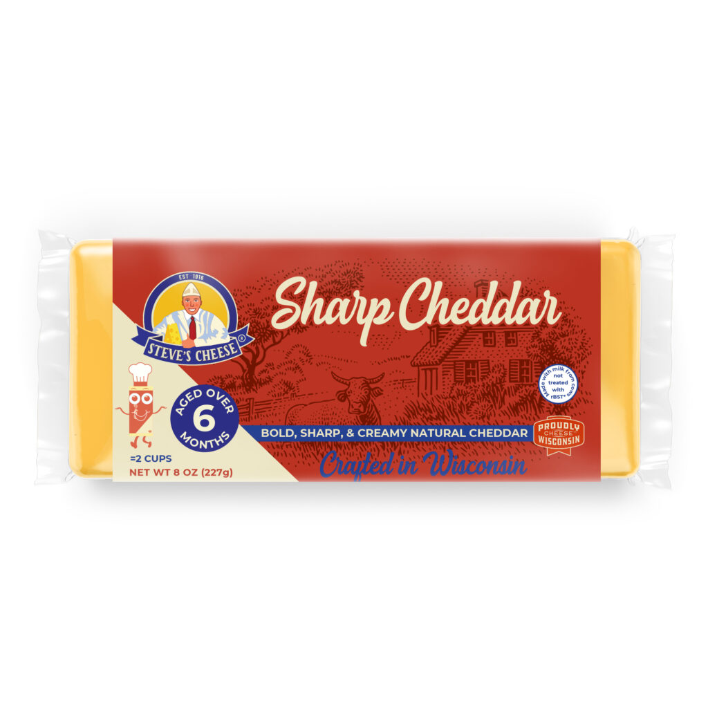
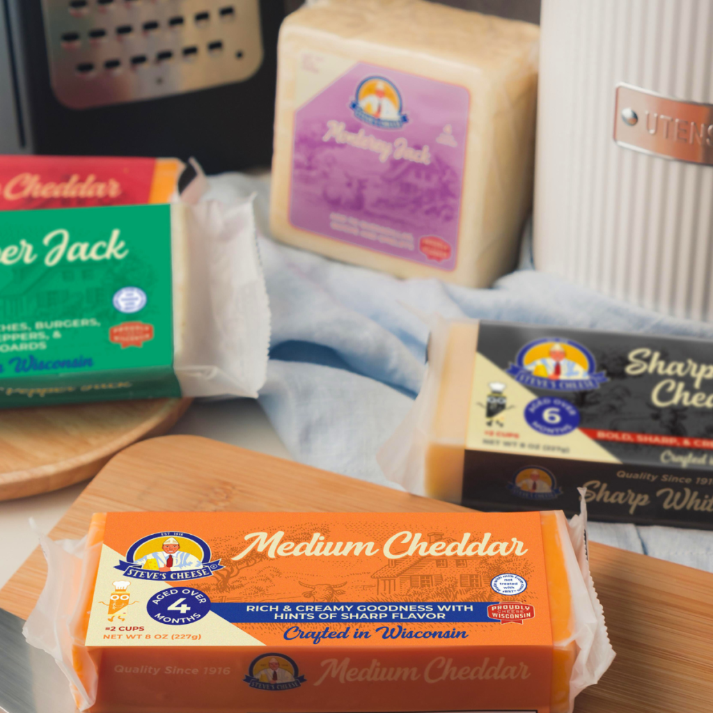
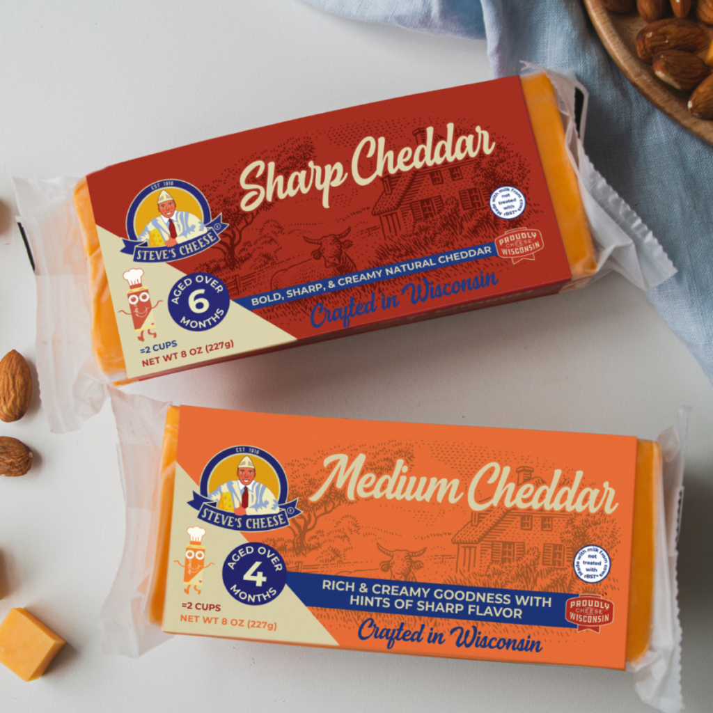
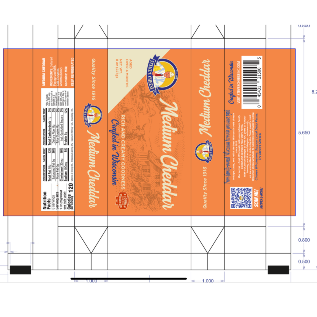
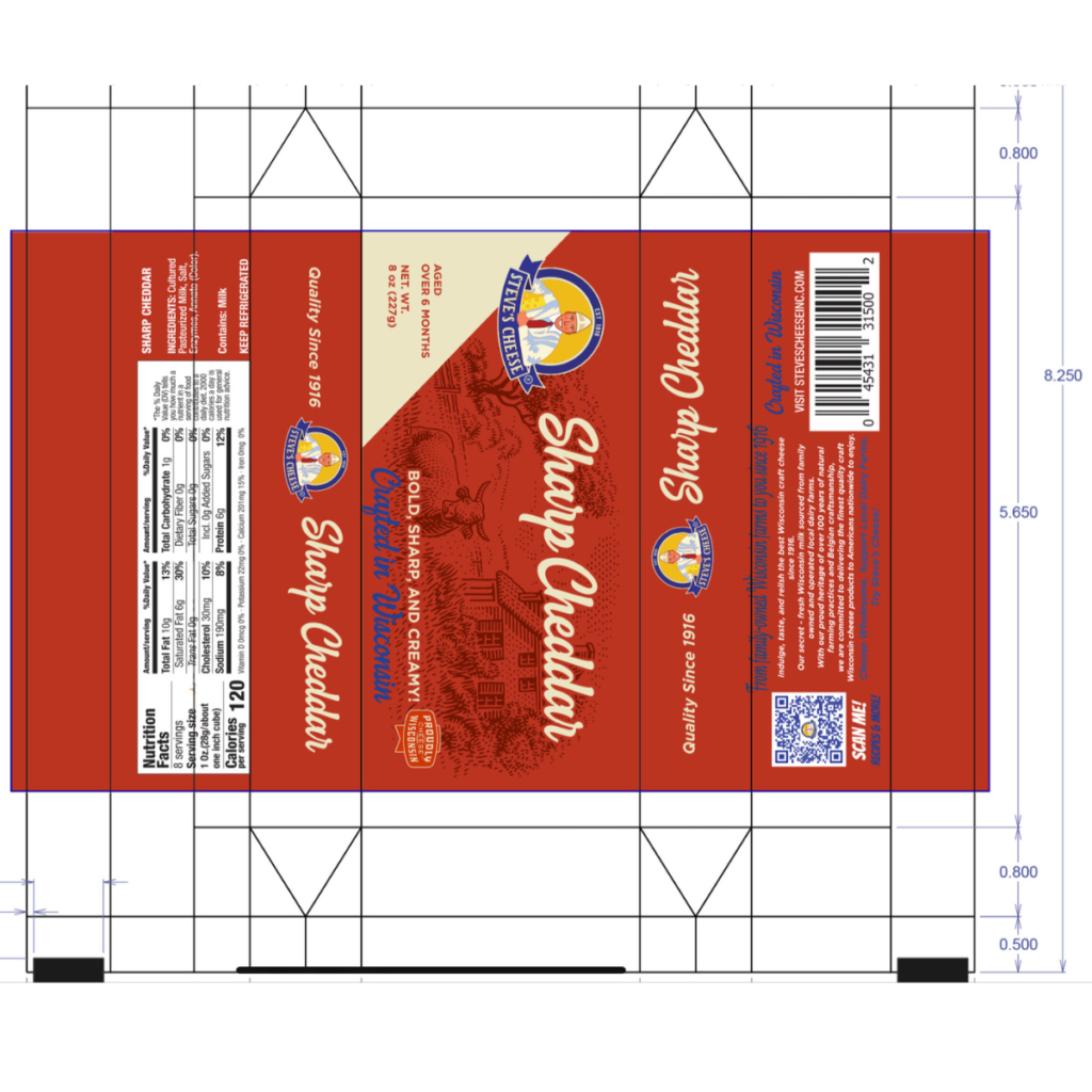
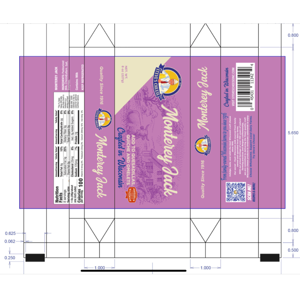
For the Brand introduced a packaging design that blends vibrant pop art colors with inspiration from vintage ice cream and candy bar cartons of the 1940s-50s. By incorporating two tones of a single color, we added depth and dimension, creating a dynamic contrast that enhances visual appeal. This balance of nostalgic charm and modern design creates a seamless connection between the past and present.
A key element of the design is the imagery of a homestead dairy farm, prominently featured on the front. This pays tribute to Wisconsin's rich dairy heritage and honors the hardworking families who have preserved its legacy as “America’s Dairyland” for over 180 years. The result is a design that evokes nostalgia, celebrates tradition, and proudly showcases Wisconsin's deep roots in dairy farming.